Budopunkt

Rebranding the oldest Estonian martial arts gear shop.
2018
WE WORKED ON
Strategy
Branding
Art directing
Advertising
Typography
AWARDS
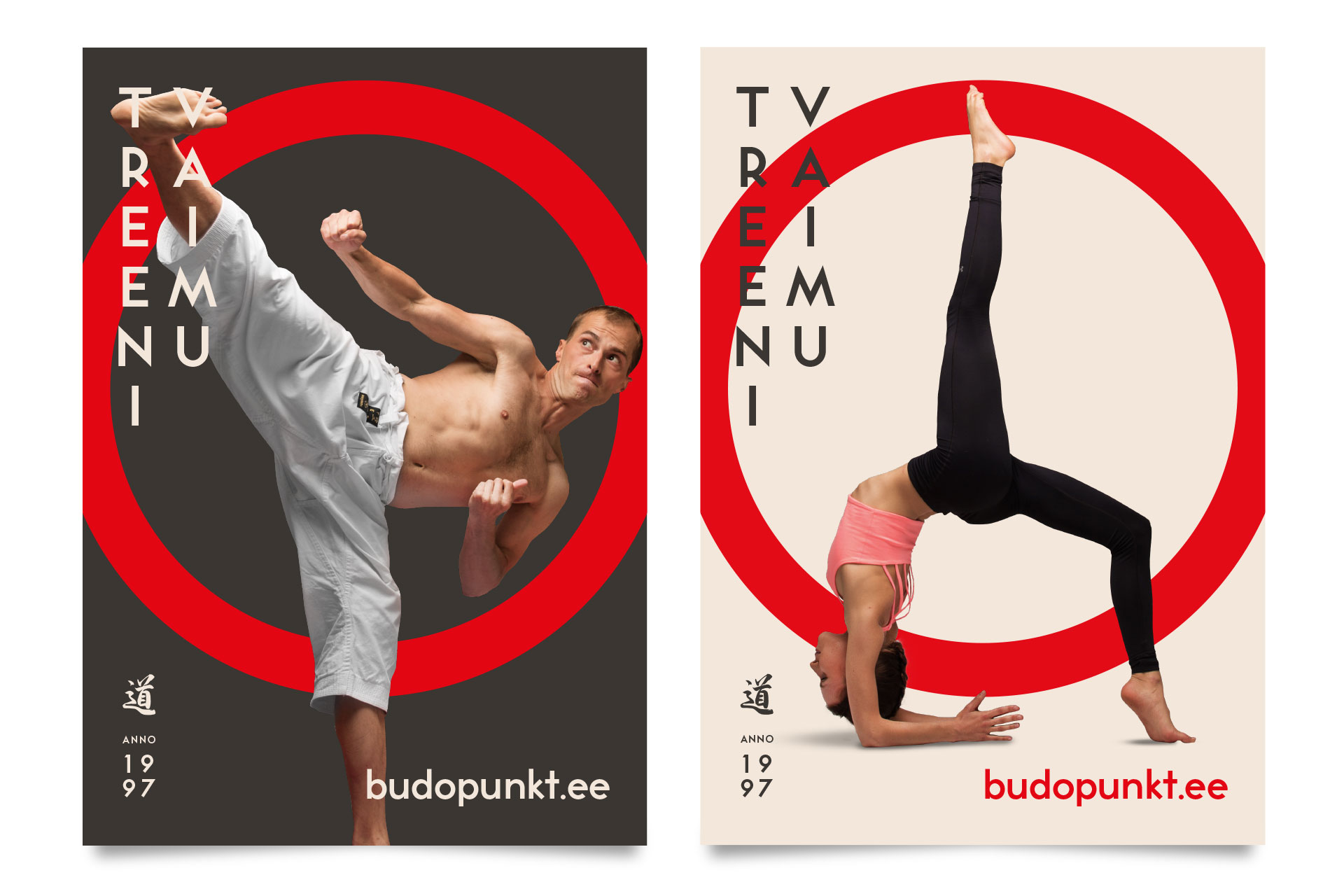
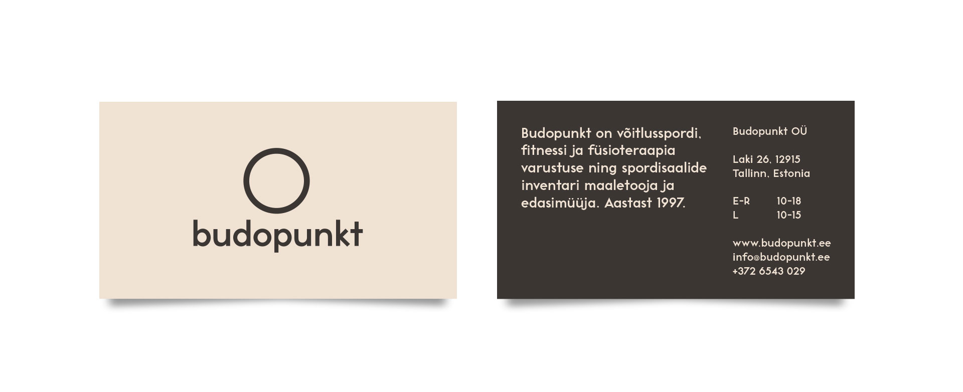
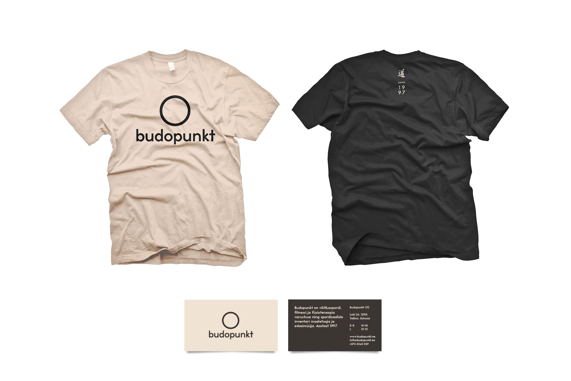
The circle motif already used in the logo symbolises inner peace and becoming whole. It became the central communication element.
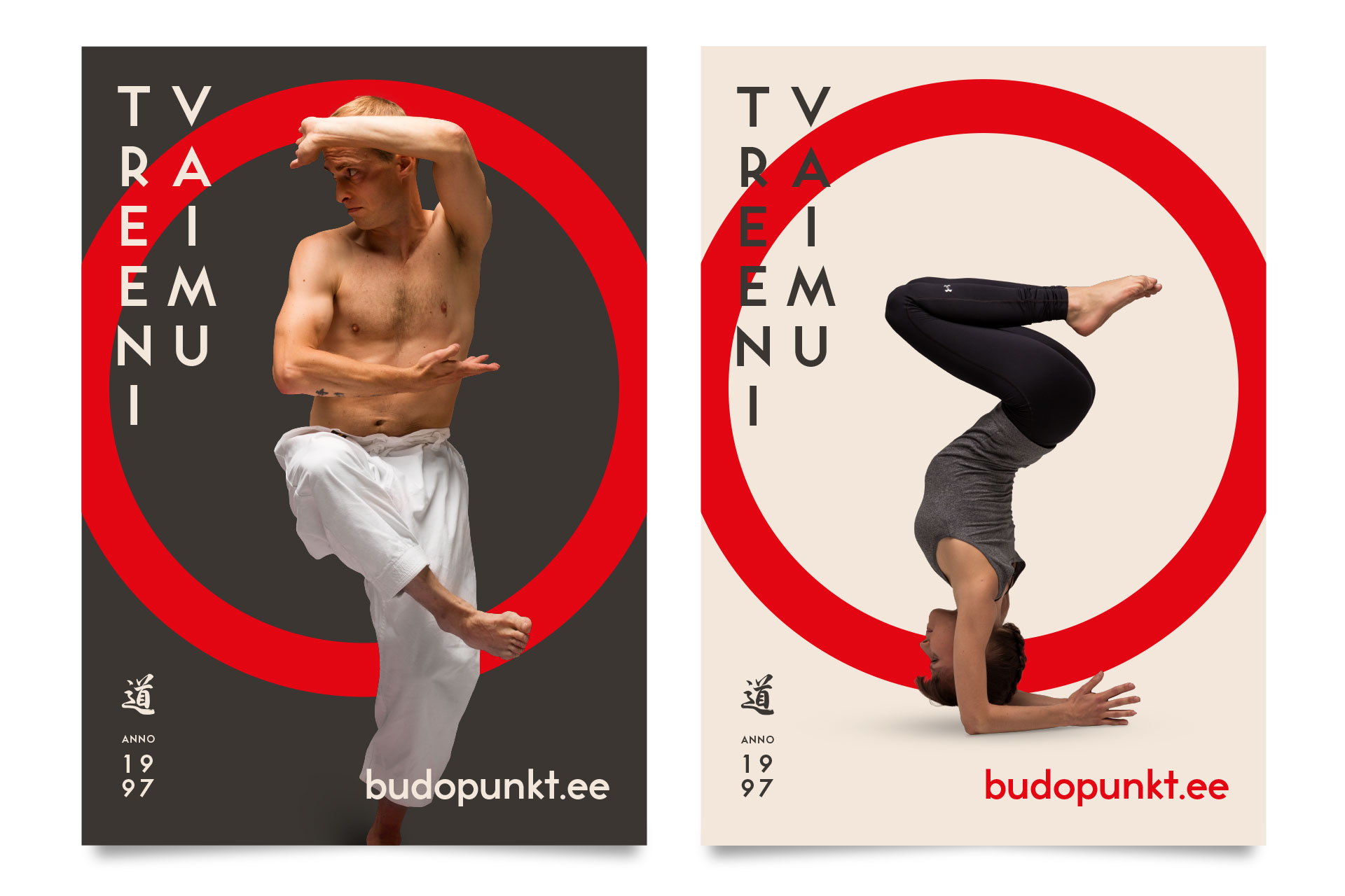
To keep the brand visually fresh in the long term, we art directed and took 100 photos of yoga and martial arts poses.

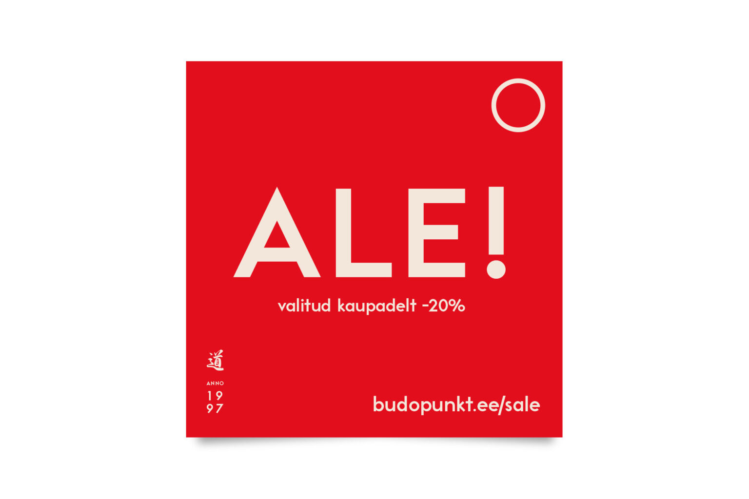
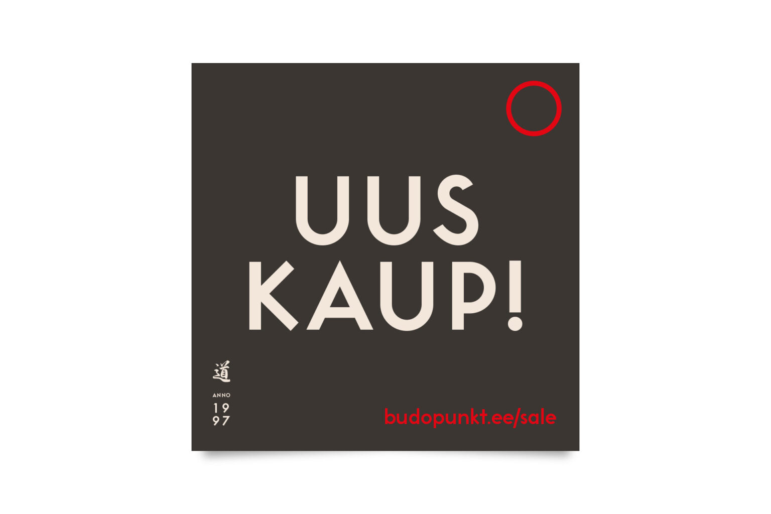
The result is a brand identity that is closer to its “budo” roots and yet, has a modern feel to it.
Visual Identity & Strategy
View All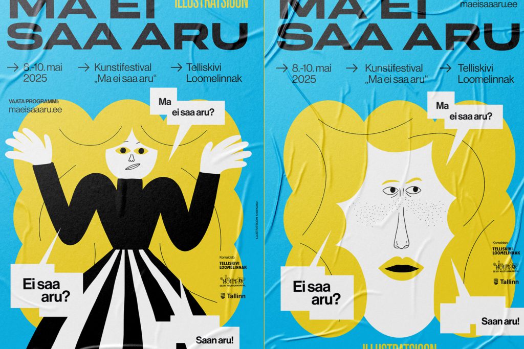
A festival exploring the various aspects, joys and concerns of the field of illustration

Visual identity for a web tool built to create global campaign pages.
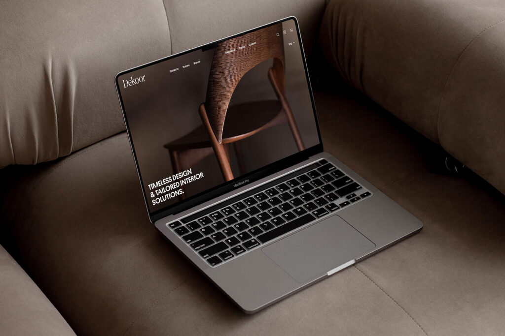
A timeless concept for an interior design salon

A fresh minimalist identity for a creator of high-quality and innovative solar roofs.
Exhibitions & Wayfinding
View All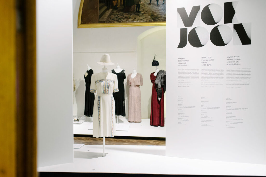
Exhibition about Estonian ladies’ fashion of the 1920s to 1940s.
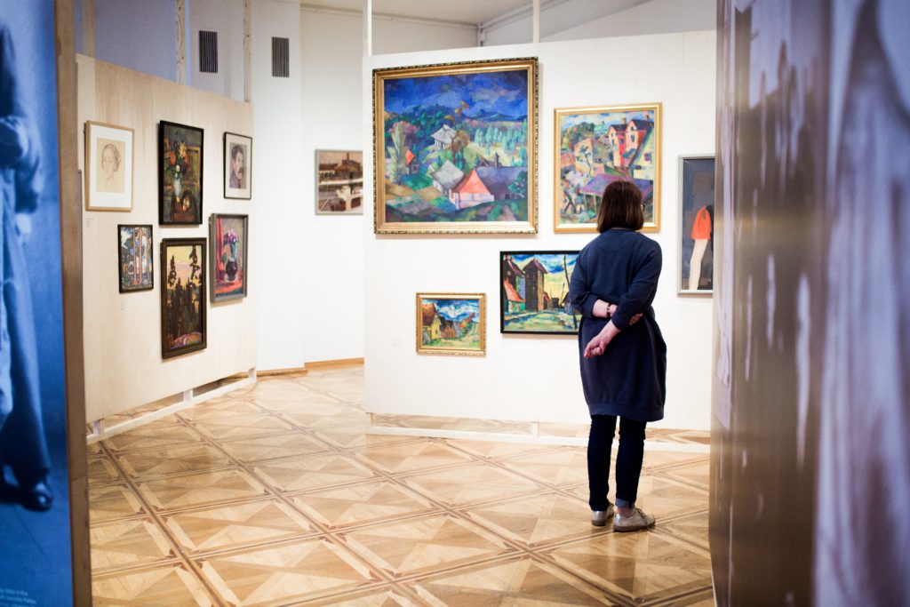
An exhibition celebrating 100 years of art education in Tartu.
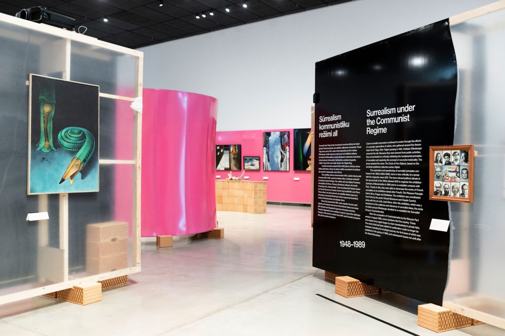
Graphic design for an exhibition where Czech and Estonian surrealism enter into a dialogue
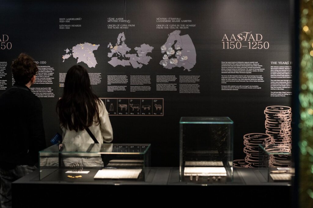
Exhibition design for the History Museum
Digital Experiences
View All
Books & Editorial
View All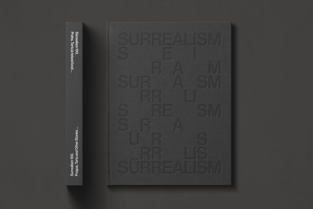
Design for the exhibition catalog
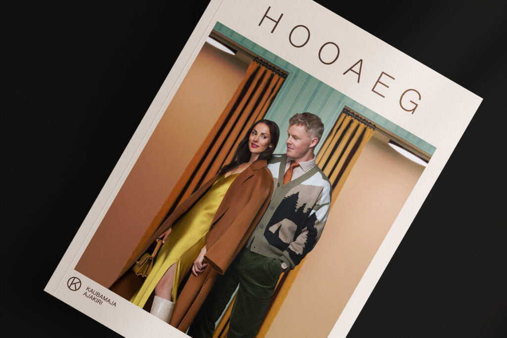
Refreshing the Kaubamaja Magazine

A popular science book about creativity, thought flashes, the curse of smartphones, and the exciting secrets of the human brain.
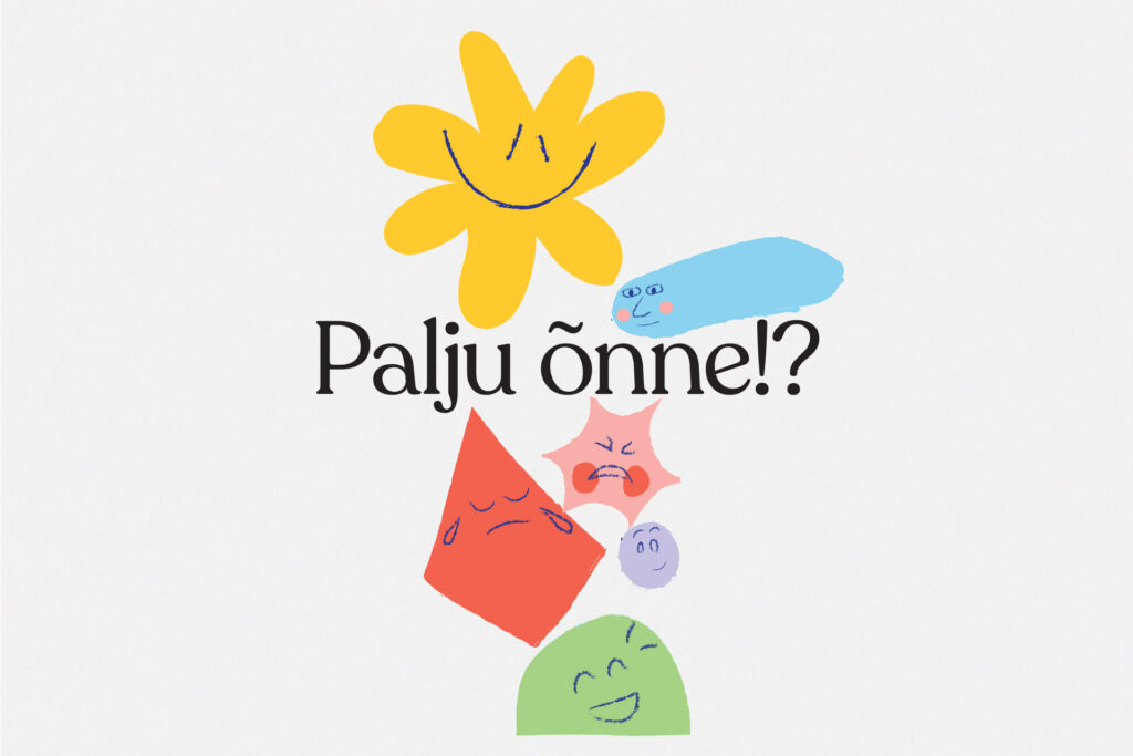
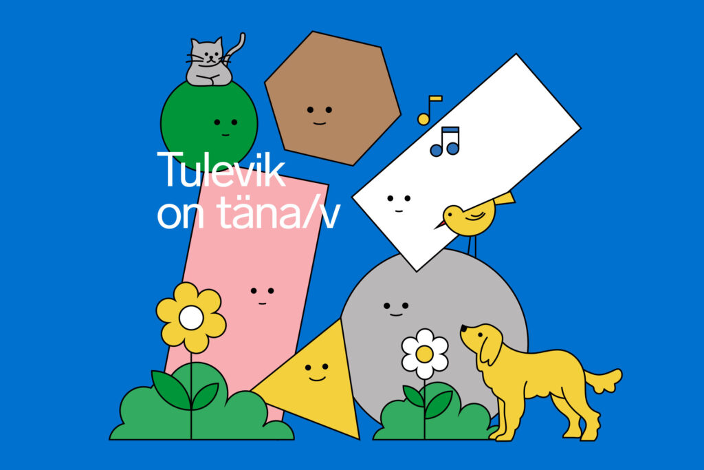
Visual identity and illustrations for an exhibition on well-being, mental health, and balance.
Events & Festivals
View AllA festival exploring the various aspects, joys and concerns of the field of illustration
Seasonal design for Tallinn Urban Space Festival that speaks to people of all colours and shapes.
Seasonal design inspired by circularity.
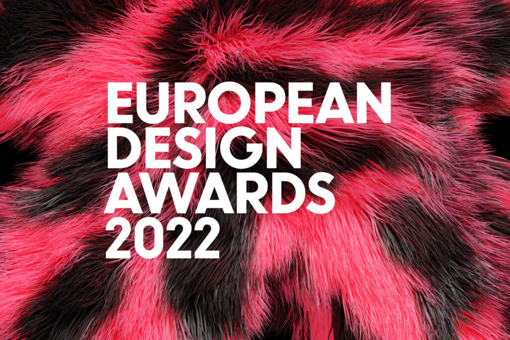
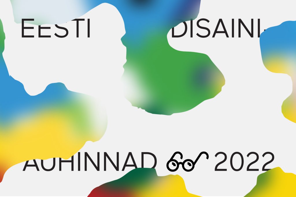
Seasonal design for the European Design Awards 2022 in Tallinn
Illustration
View All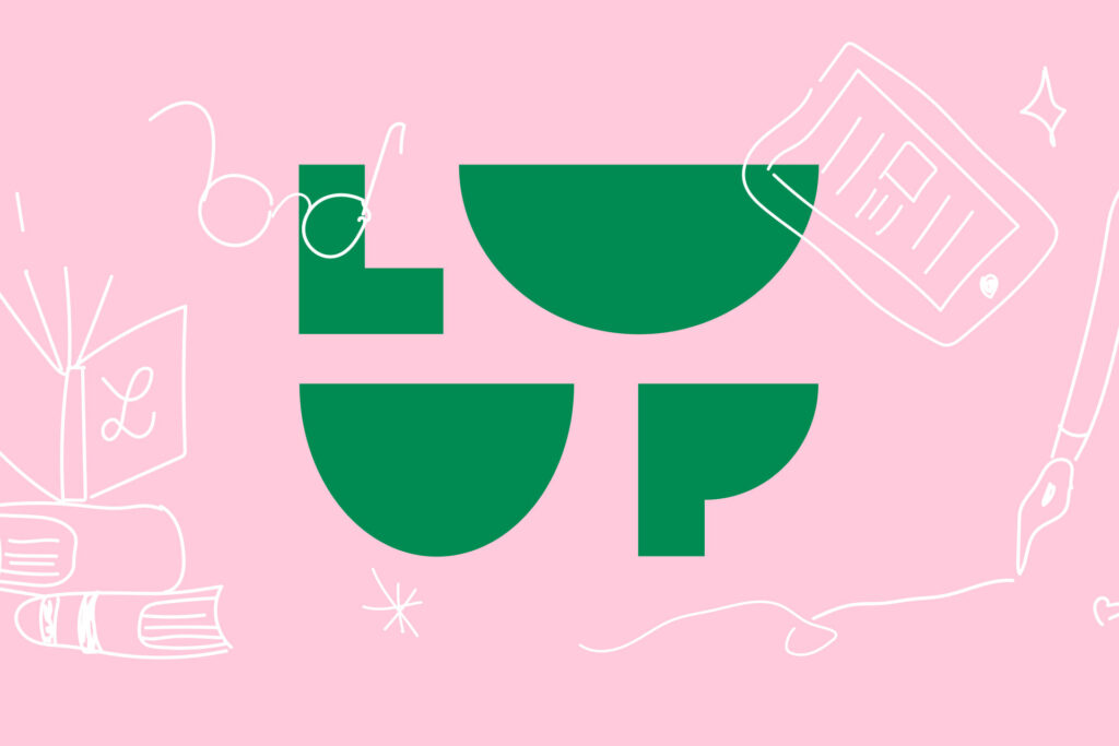
A fresh visual identity for a beloved children’s literature festival.
A popular science book about creativity, thought flashes, the curse of smartphones, and the exciting secrets of the human brain.
Visual identity and illustrations for an exhibition on well-being, mental health, and balance.
Creating a quirky new visual identity for a beloved independent bookstore and publisher.