Visual identity for a web tool built to create global campaign pages.
Ülemiste City
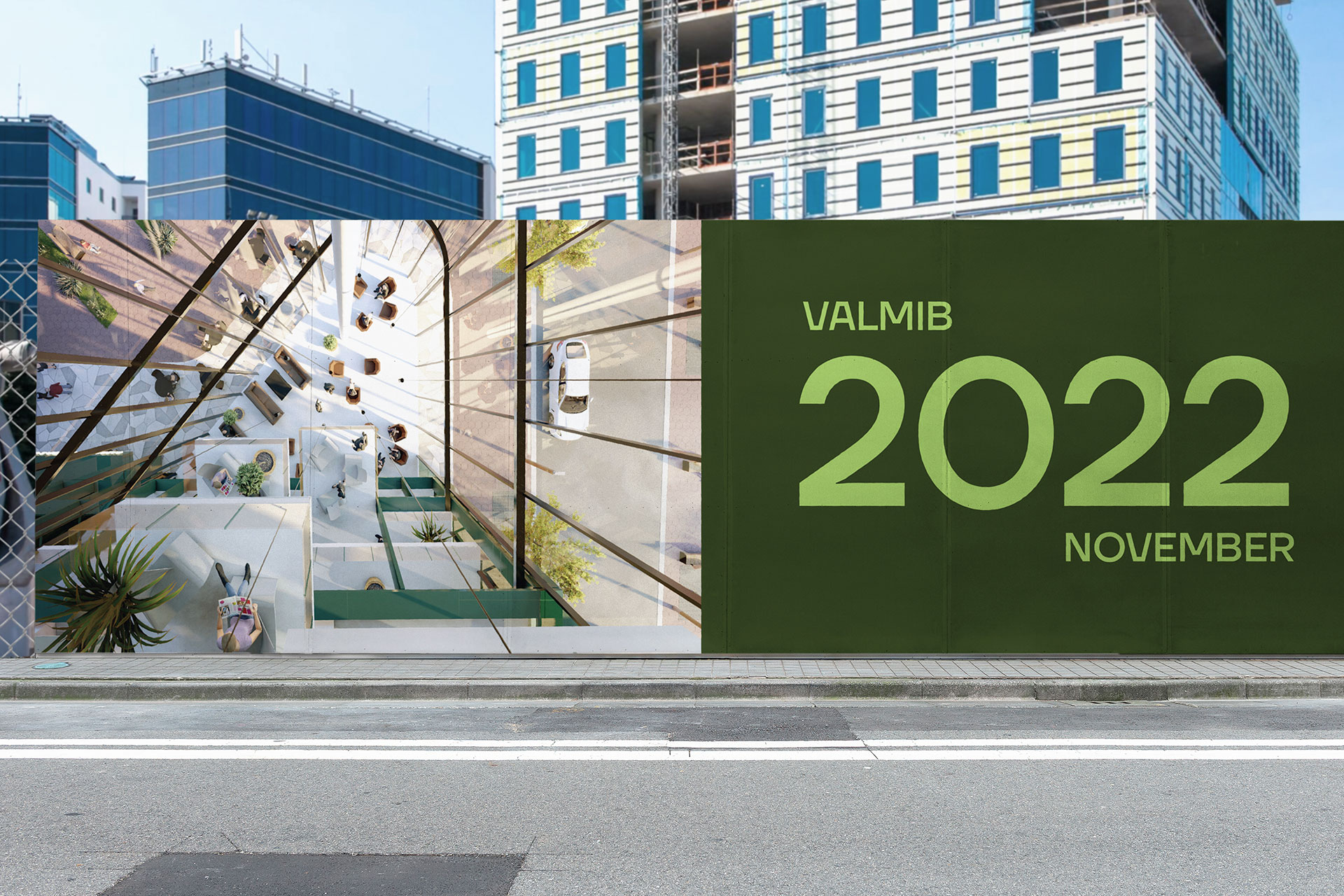
Estonia's biggest and fastest growing smart business campus rebrand.
2021
WE WORKED ON
Branding
Art direction
Typography
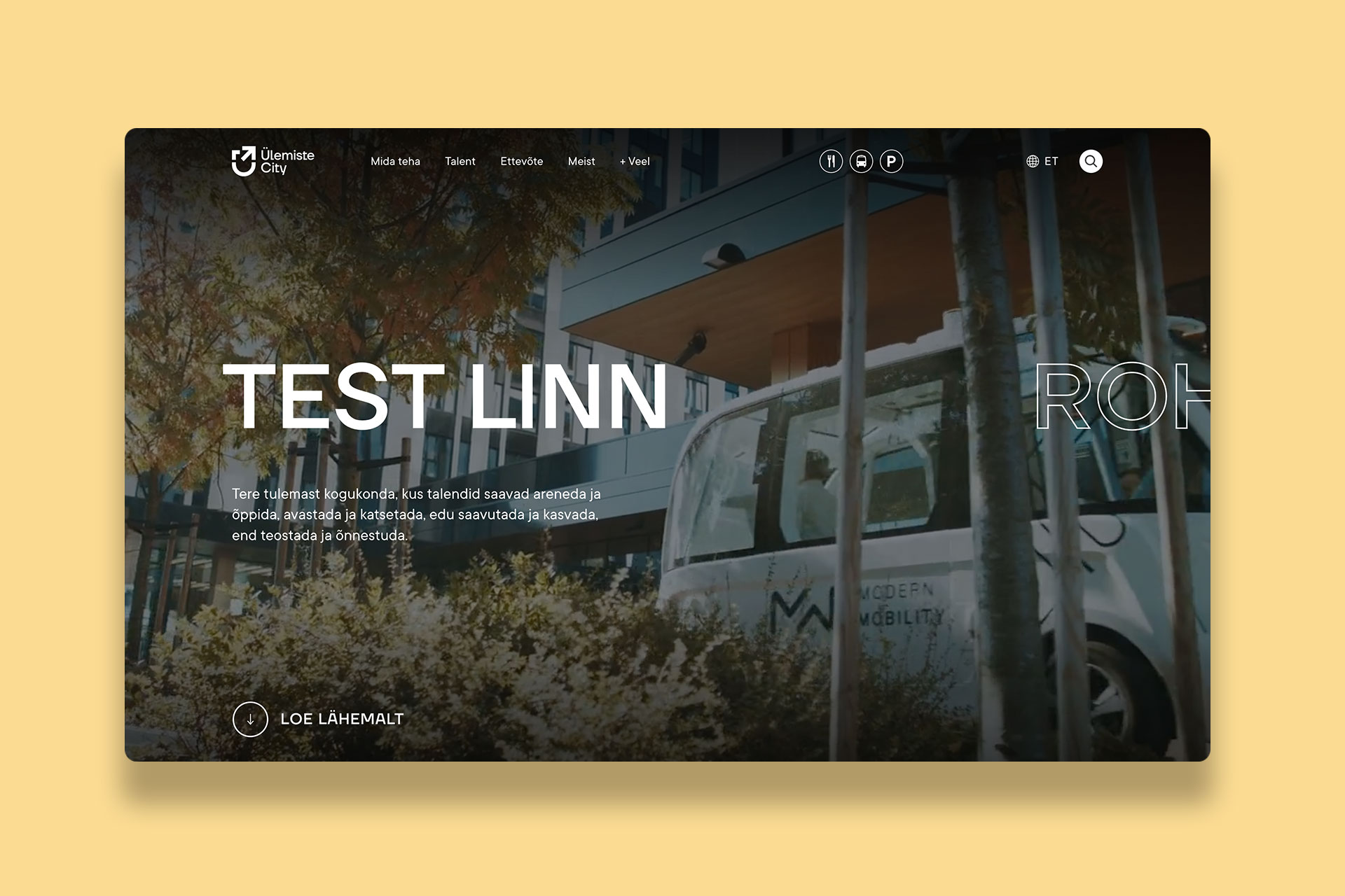
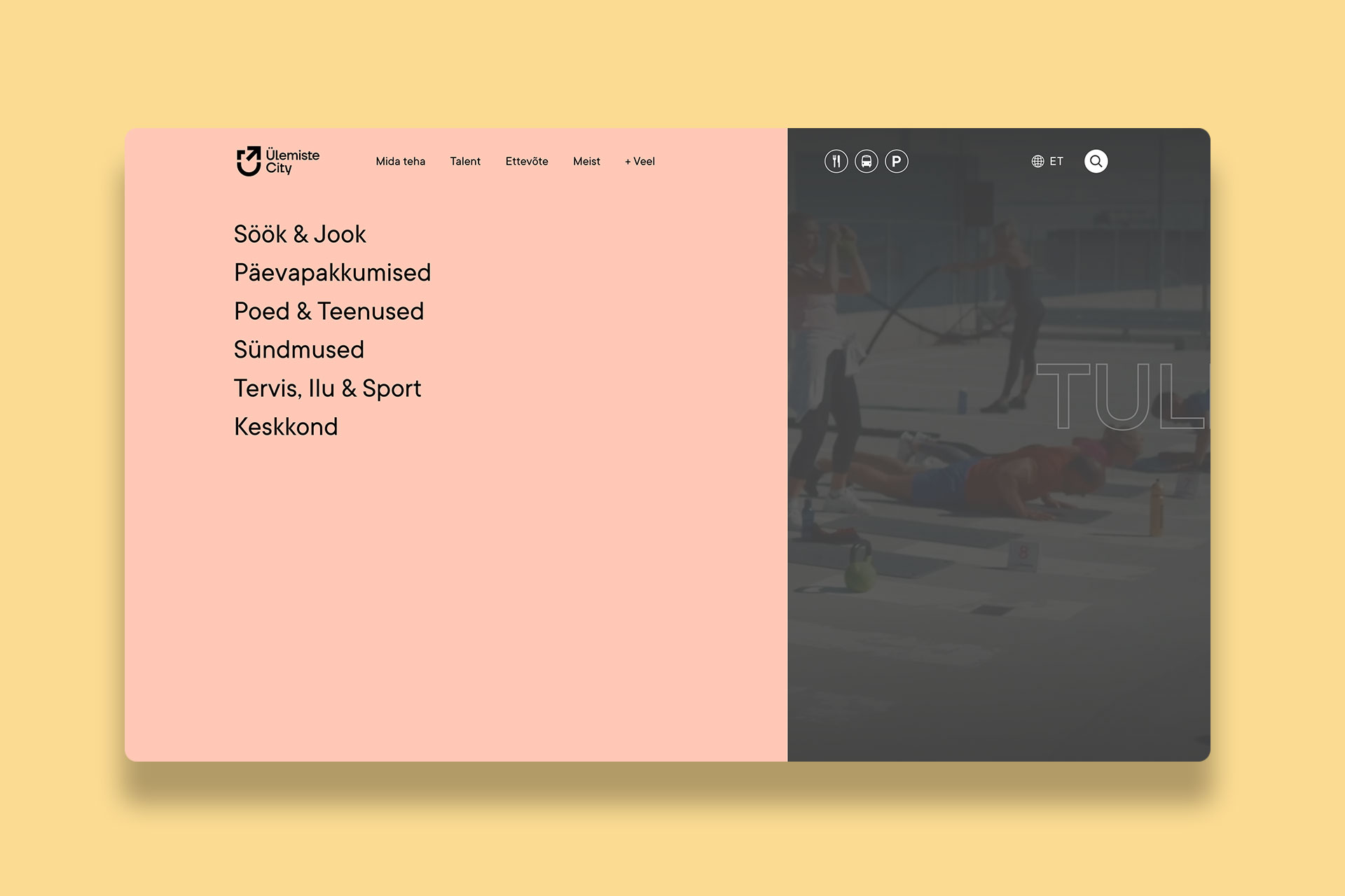
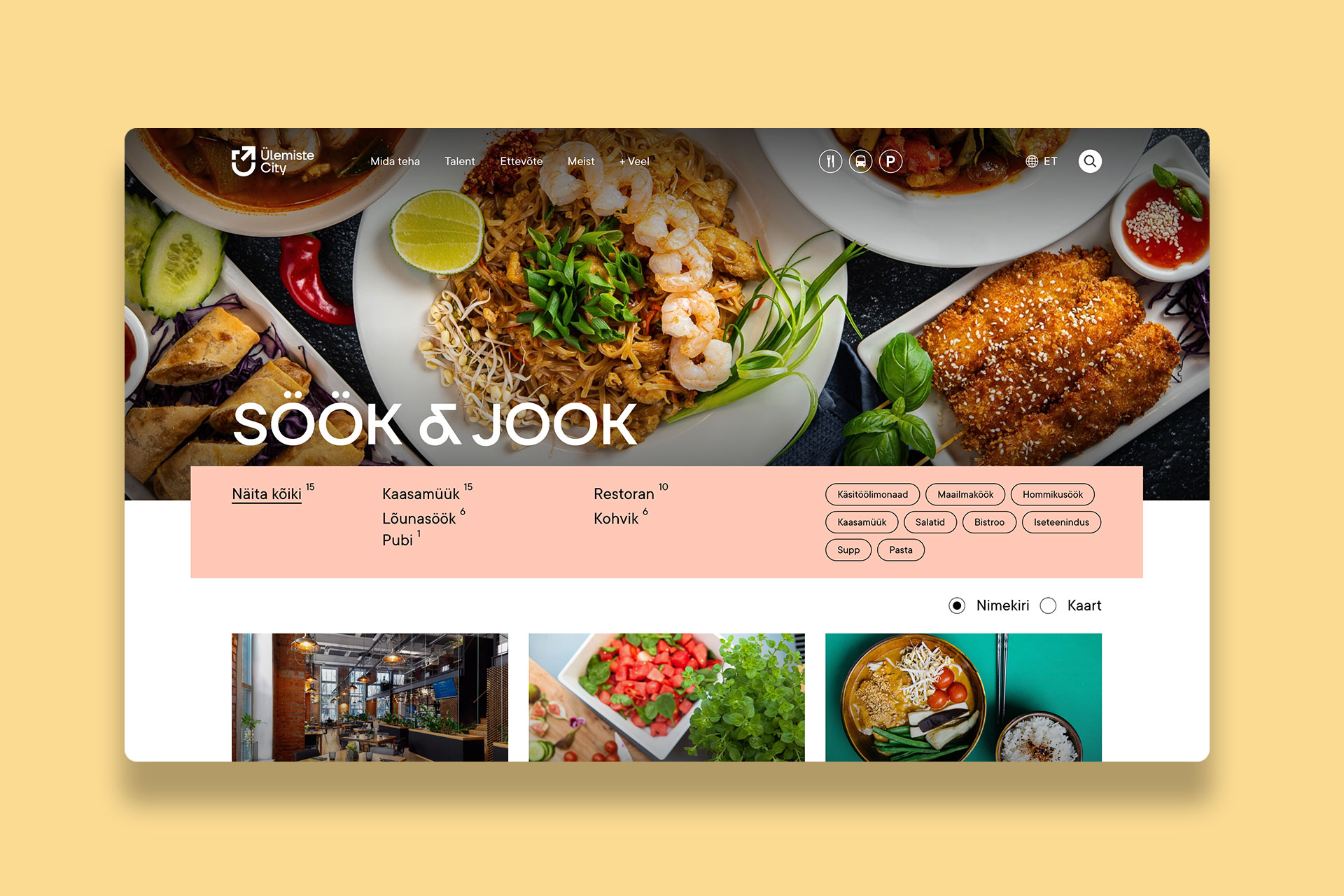
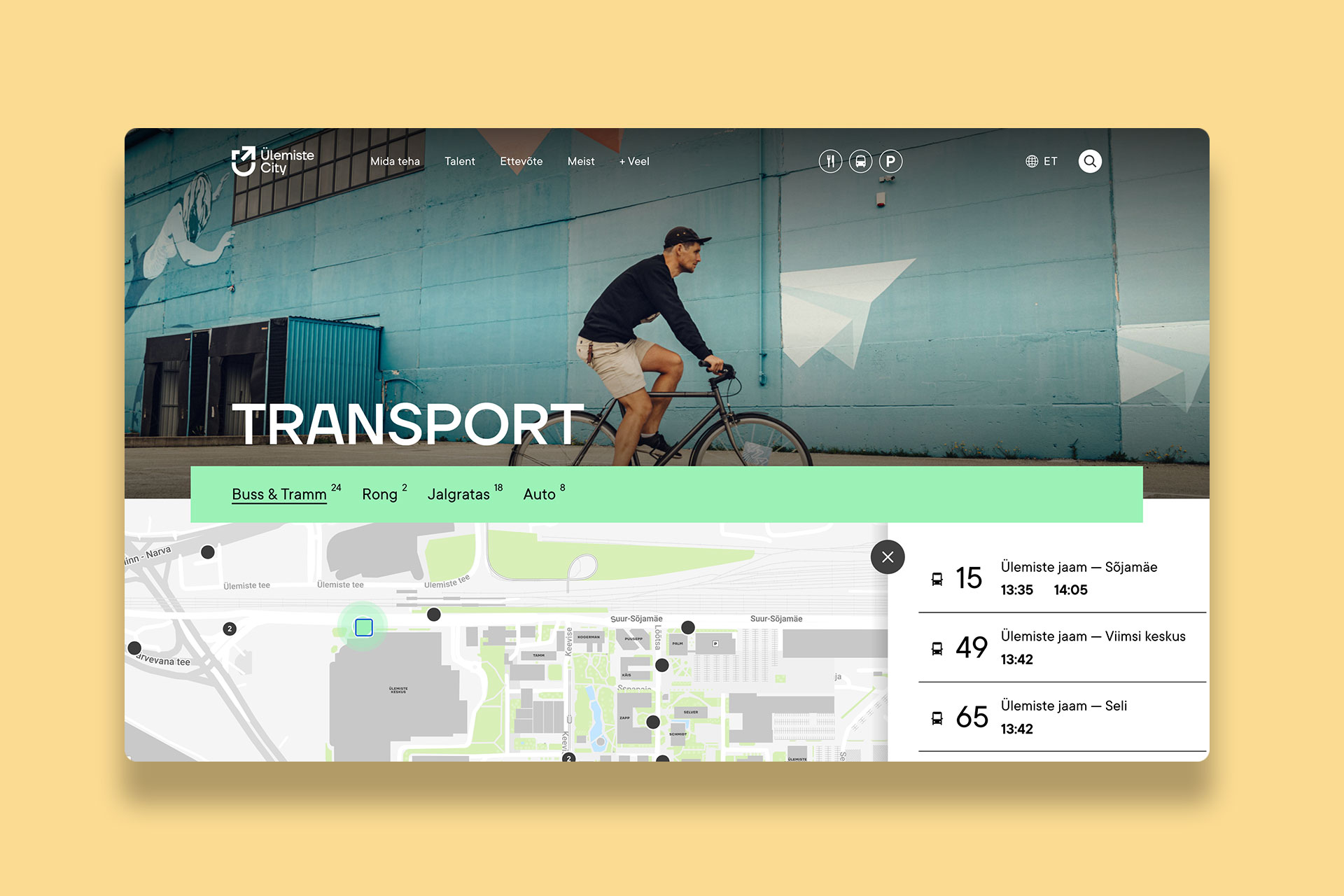
Web design
AWARDS
GOLDEN EGG
Bronze - Rebrand, 2022
Since its beginnings in 2005, the ambition has been to create a valuable environment for talents to develop, grow and succeed.
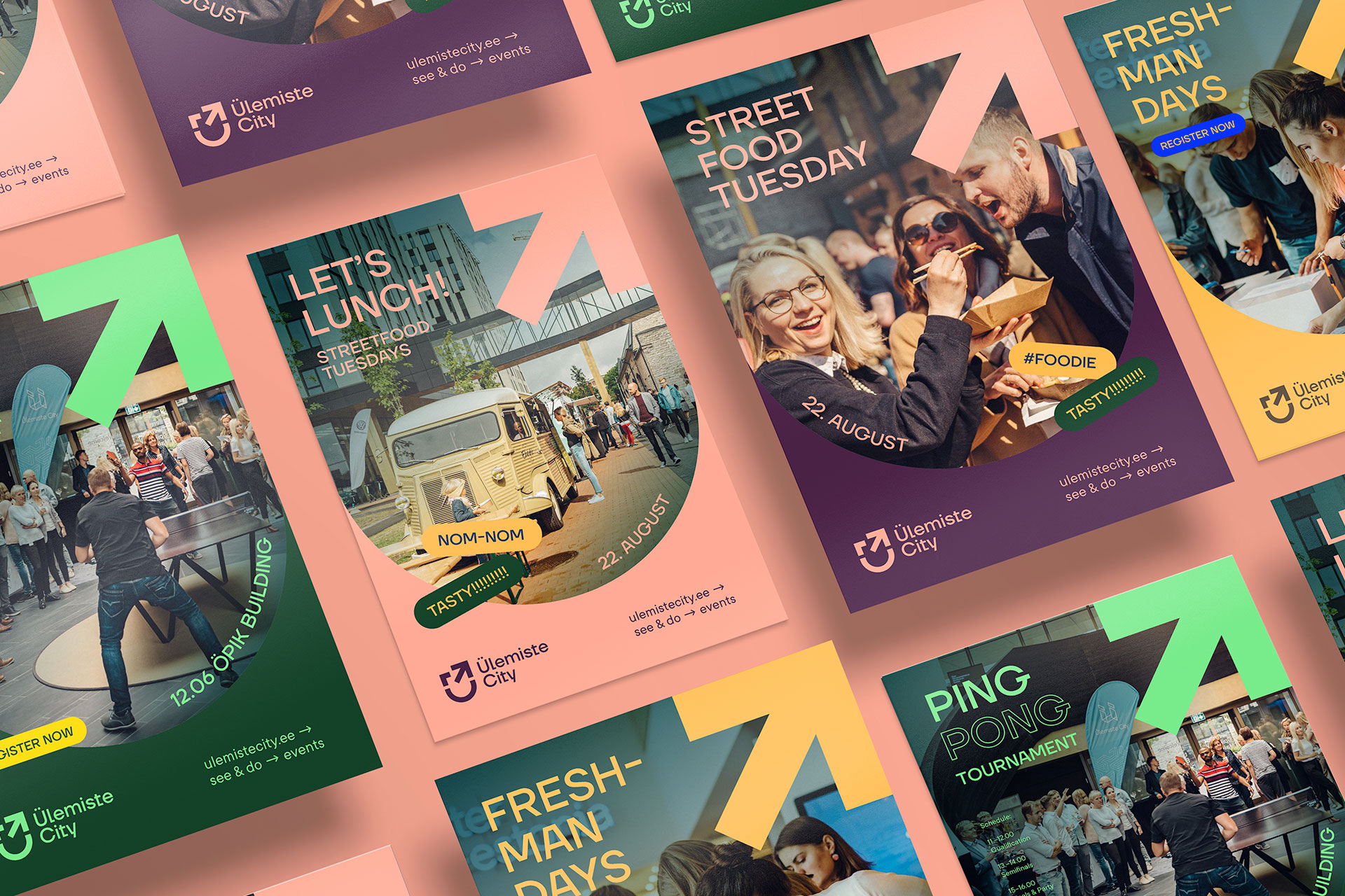
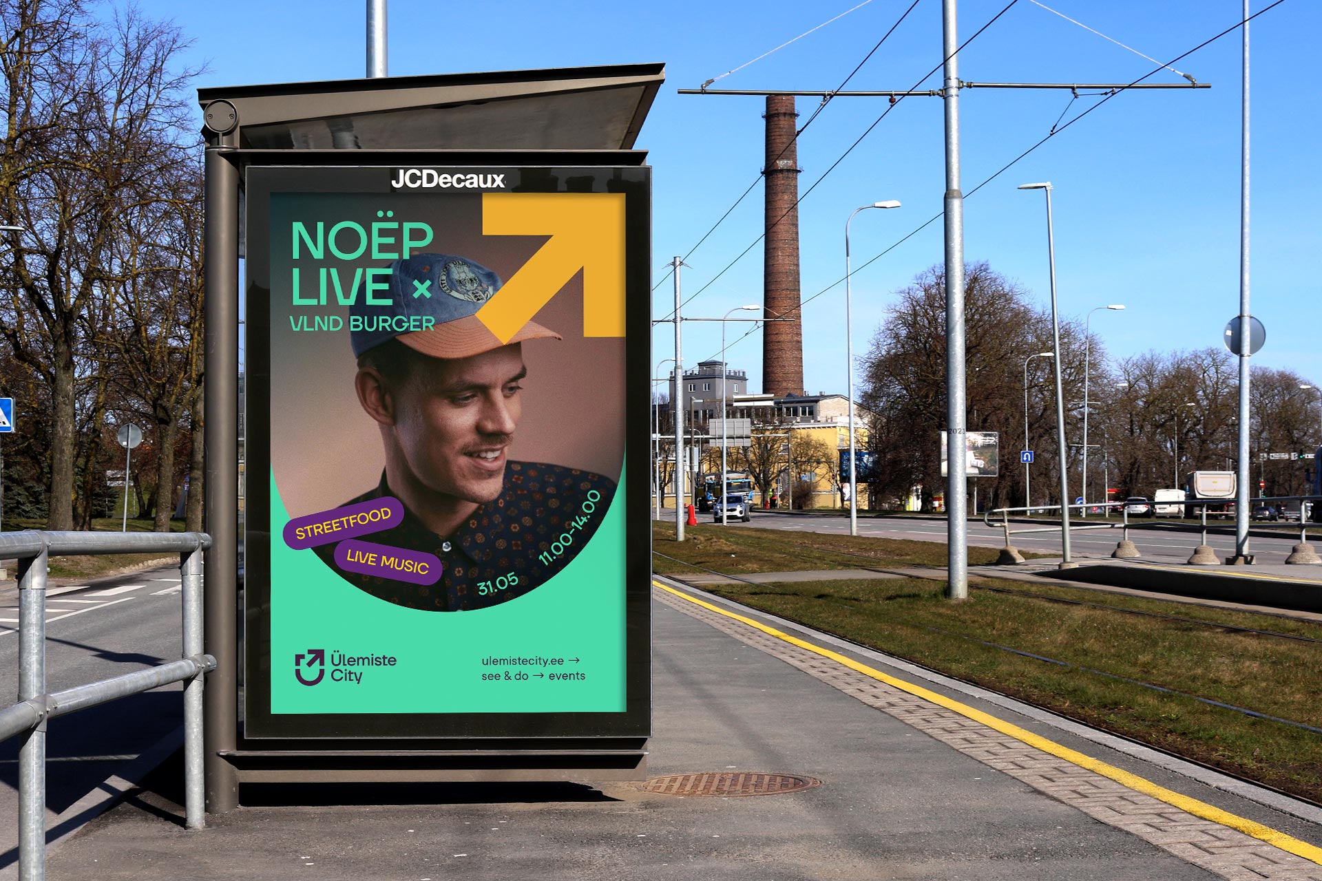
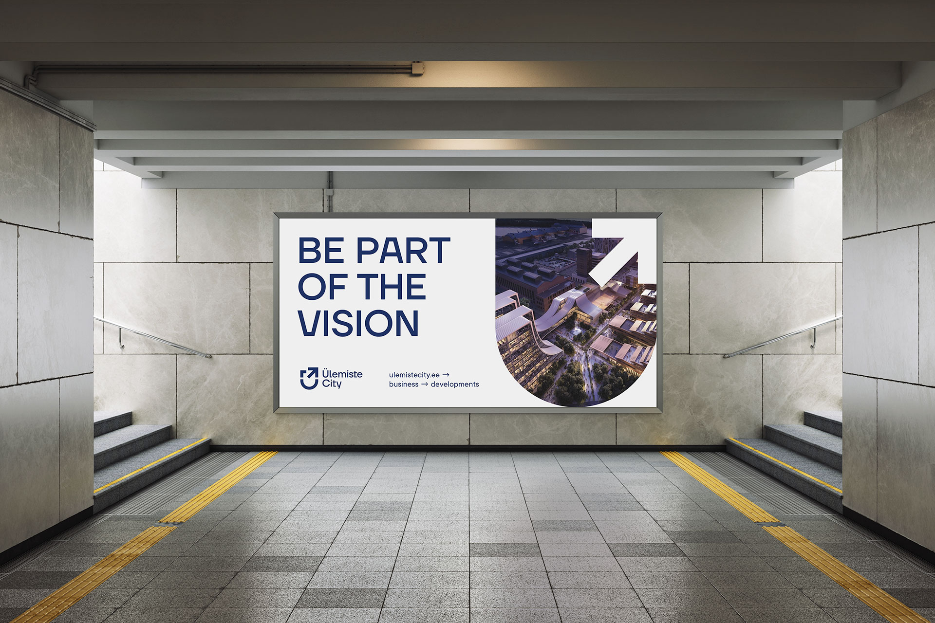
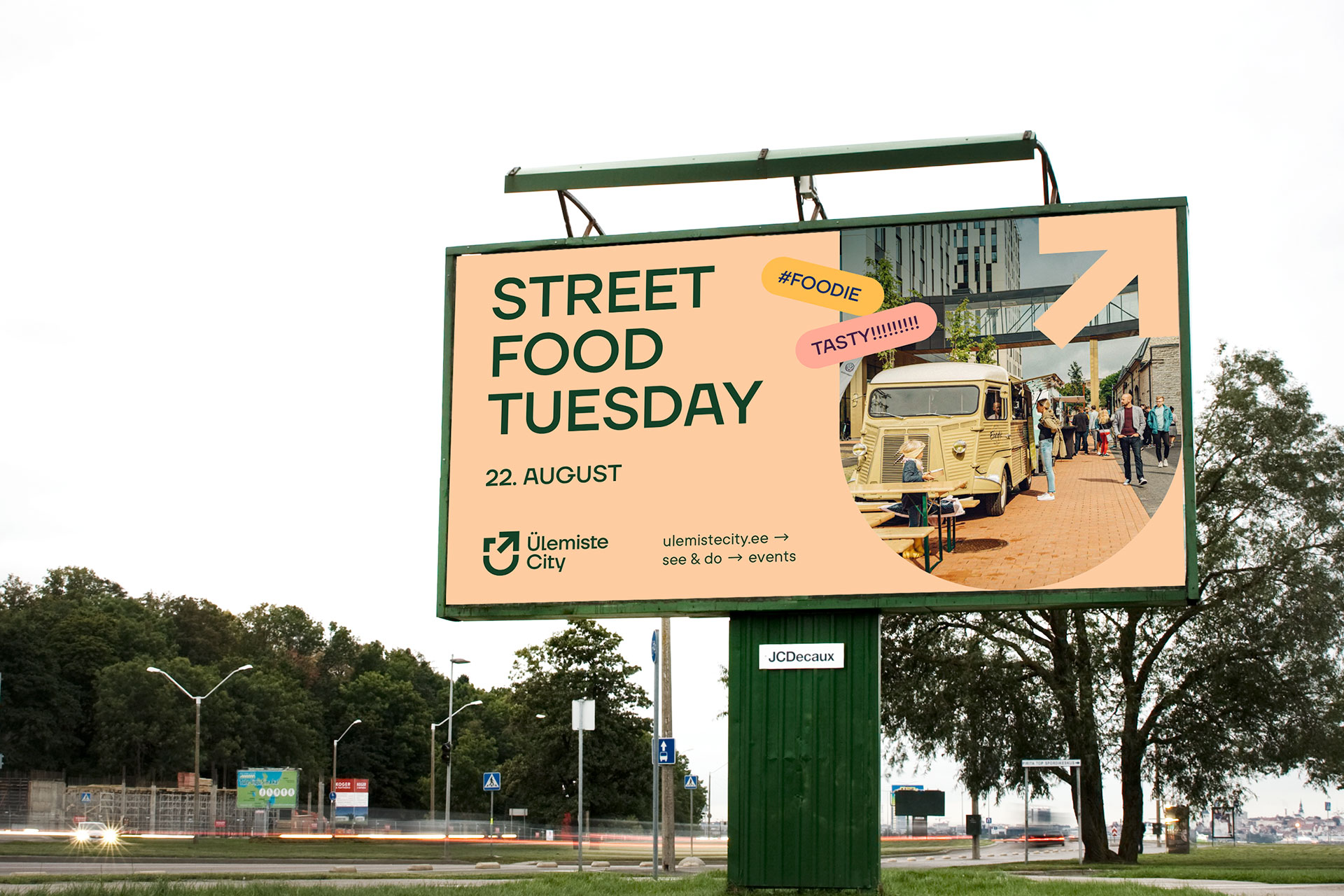
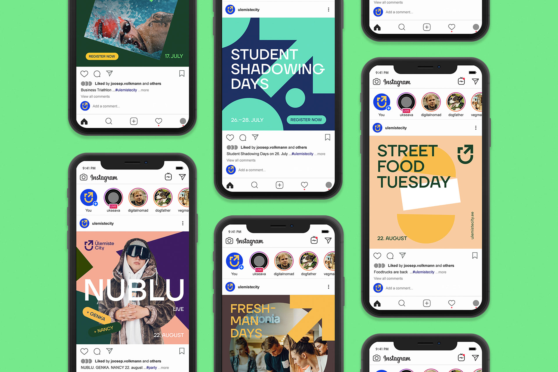

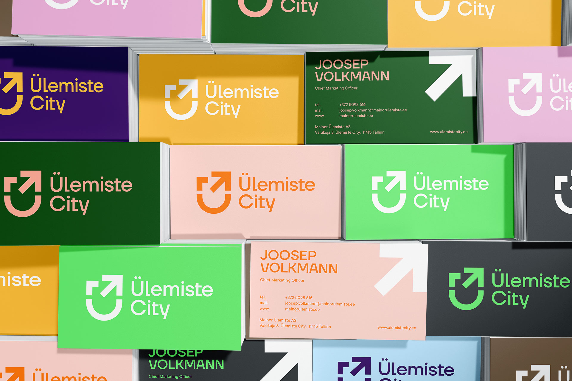
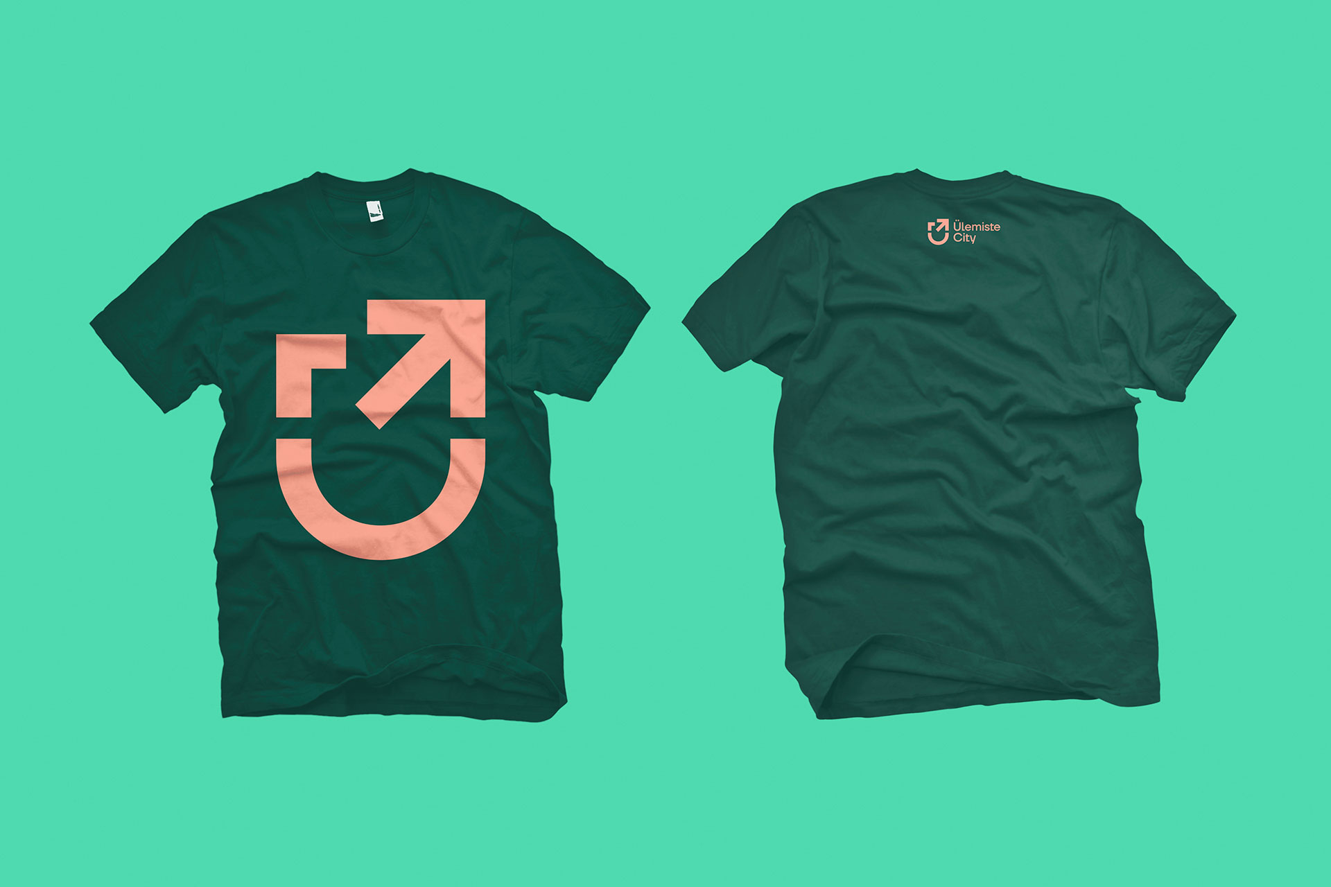
For the logo we created a symbol in which a careful viewer can see a coat of arms, the letter Ü and an upward driven movement.
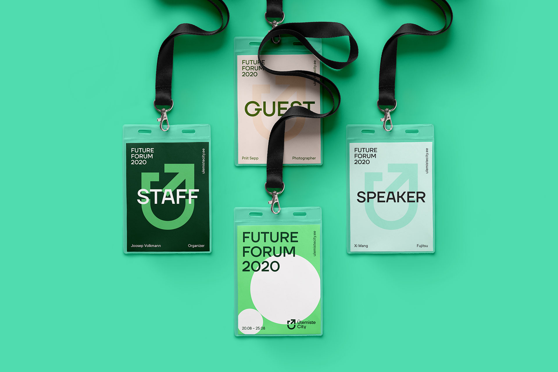
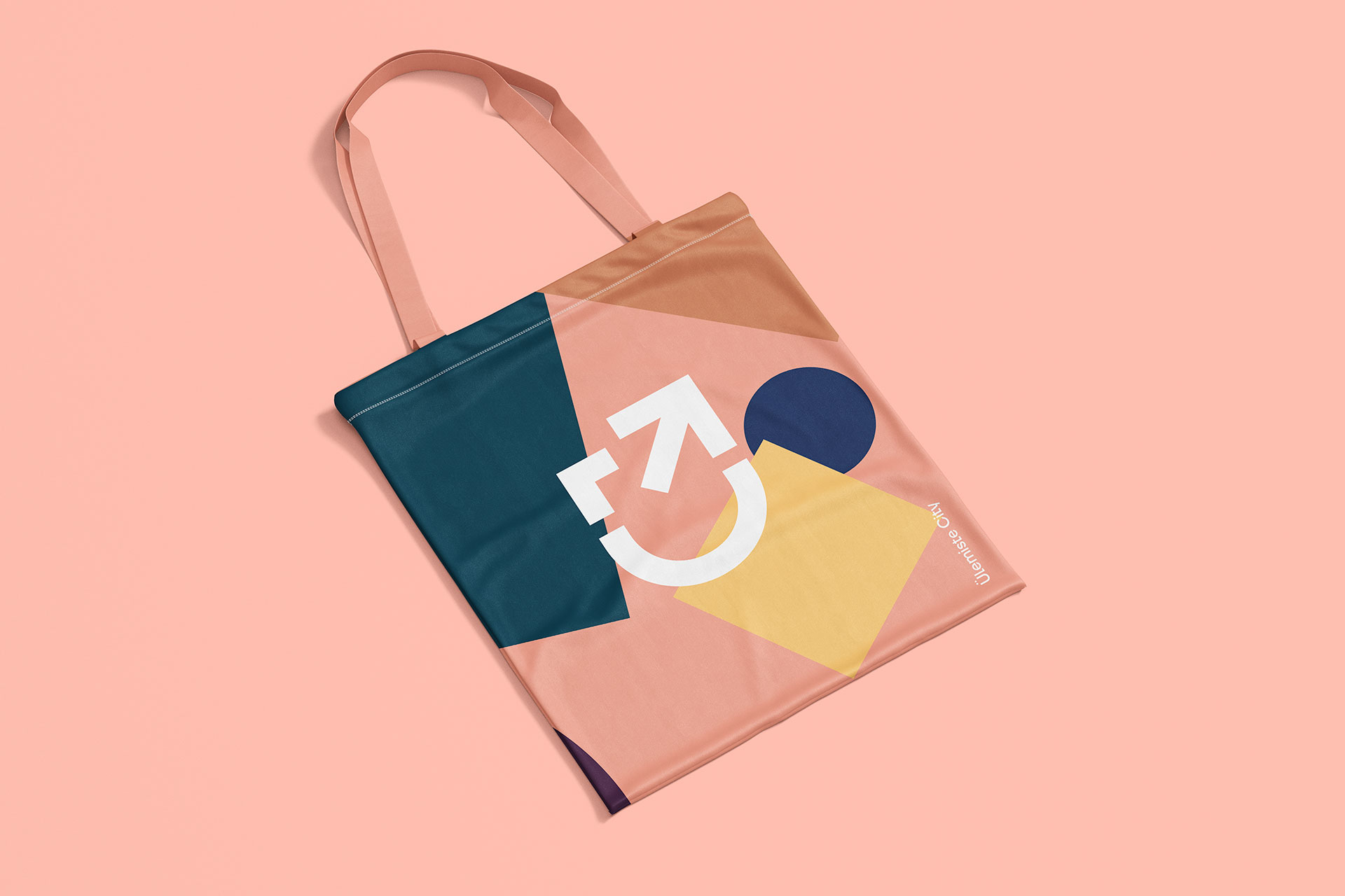
We created a spectrum of colour variants and shapes to be combined according to the type, target group and the desired mood of an event or advertising.